Using the Program
This page details some of the tasks available in tablexplore. For a general introduction also see the screencast at https://youtu.be/Ss0QIFywt74. Most of this functionality is available when you just use the table widget as well as the tablexplore application. Installing in windows or with a snap in linux should provide a menu item to launch the app. Otherwise use the command line, detailed below.
Purpose of the program
This program is for analyzing tabular data but is not meant to be a spreadsheet. Data is treated in a row/column centric fashion and a lot of the analysis is done in bulk on entire rows/columns at once. So although you can edit cells it is not especially meant for data entry. You can use a spreadsheet for that and then import the data. Cell formulas are not possible for instance. You can however delete rows, columns and clear blocks of cells. New columns can be created through the use of basic functions. The primary goal is to let users explore their tables interactively without any prior programming knowledge and make interesting plots as they do this.
Interface layout
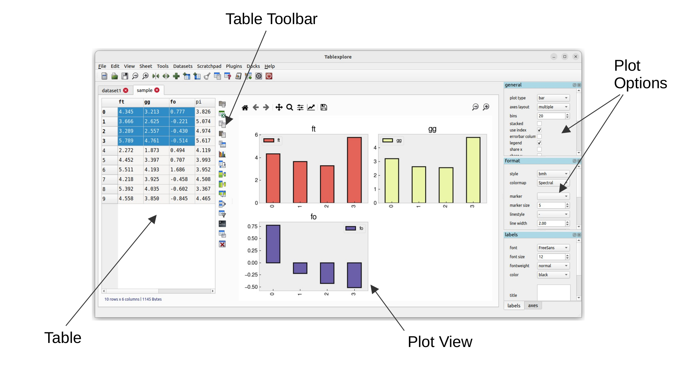
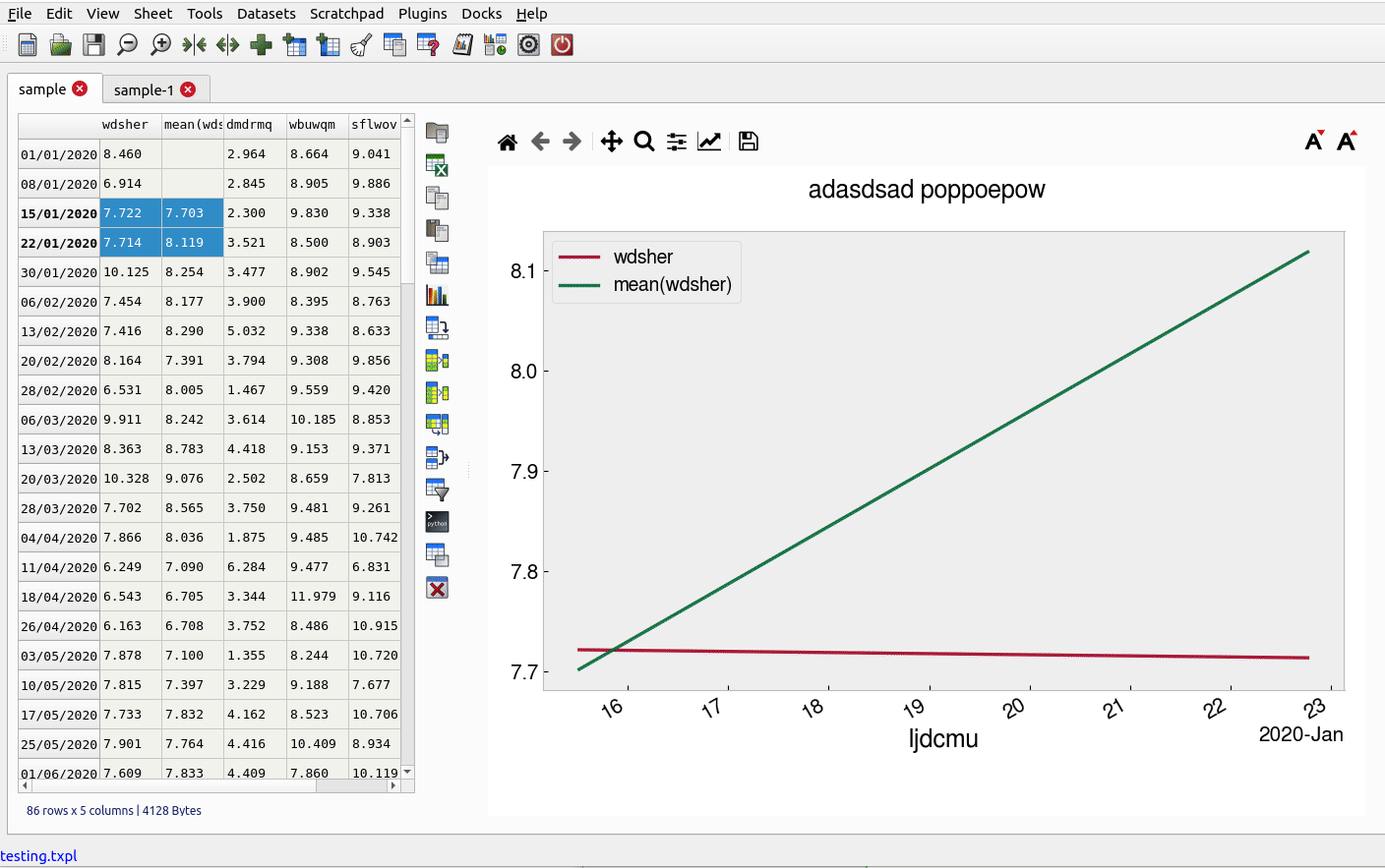
The table is laid out with headers for row and columns. Much functionality can be accessed from the tools menu but also by right clicking on the row and column headers. You can resize columns by dragging in the header. Rows cannot be resized independently (zoom in to enlarge). Unlike spreadsheets column and row headers can use indexes (arbitrary labels). You can set any column as an index. This has extra functionality when it comes to plotting. Duplicate column name indexes are allowed though should be avoided if you want predictable behaviour. Every table has a vertical toolbar on the right and a plot view associated with it. You can make the plot hidden if needed.
Command Line
Launching tablexplore from the command line allows you to provide several options using unix type ‘-’ switches.
Show help:
tablexplore -h
Open a project file:
tablexplore -p <project file>
Open a csv file and try to import it:
tablexplore -i <csv file>
Open an excel file and try to import it:
tablexplore -x <excel file>
Import text files
Import of csv and general plain text formats is done from the file menu, toolbar or by right-clicking anywhere in the table and using the context menu. The dialog has most basic options such as delimiter, header selection, comment symbol, rows to skip etc. When you change the import option you can update the preview to see if the new table will look correct. You then press import. Note that it is generally a good idea to remove empty lines and bad data if you can before importing. The table at the bottom of the import dialog contains the column data types (dtype) of each column. You can set this manually if you want to make sure a column is imported correctly. For example, numbers with leading zeroes will have this removed by default as the column is set to int. manually setting dtype to object avoids this.
Import multiple files
You can bulk import files using the File->Batch Import option. This allows you to choose a selection of files or to choose a folder and all the csv files inside will be recursively selected. If the files represent the same data structure they can be joined together into one table.
Saving your work
tablexplore projects (multiple groups of sheets with the plot and settings for each) are saved in pickle format and have the .txpl file extension. The program will remember table selections also. Note: it is not recommended that you use this project format for long term backup as it is subject to change with new versions. You should always keep a copy your raw data if it is important. Exporting to csv is also possible and saving individual tables to excel files.
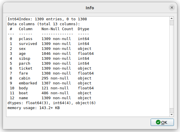
Getting table info
The status bar at the bottom left shows the size of the table in rows and columns at all times. For a more detailed summary use Tools->Table info. This brings up a window showing the type of each column and memory usage. ‘object’ columns are those with text/mixed data and float and int must be numbers only.
Cleaning data
Pandas supports a variety of options for data ‘cleaning’ or dealing with missing data. The most basic are available in tablexplore from the main menu.
Drop rows/columns with missing (empty) data
Fill missing data with a symbol
Forward or backfill with neighbouring row values
Interpolate missing data (filling in the points between)
Drop duplicates
String operations
Accessed by right clicking on the column header menu. String operations can be carried out on any column as long as they are object data types and not pure numbers.
The following string methods are supported:
split, with separator symbol - will create multiple new columns
strip, remove whitespace
lower/upper case conversion
title, convert to TitleCase
swap case
get length of string
concatenate strings in multiple columns
slice, slice string by start/end indexes
replace
Date/Time conversion
Also by right clicking on a column you can convert it to datetime which is the internal format used to store dates and is useful for plotting time series. Normally the program can infer the dates but you can select the format.
Summarizing and grouping data
For overall table statistics you can use the tools->describe table command. For individual columns you can get value counts by right clicking on the header.
The primary way to summarize data is to use the aggregate dialog. It is accessed on the right toolbar. Tables can be grouped and aggregated on multiple columns to create new summary tables. The results will be placed in the sub table below the main one and can then be copied to new sheets. Normally you would group by category columns (rather then a continuous variable like decimal numbers). The dialog has a list of columns to group by and another list box for column(s) to aggregate these groups using one or more functions. See the animated example (click to enlarge):
It is often easiest to test the selections out until you get the required result.
Pivoting tables
Pivot tables is an operation some people might be familiar with from excel. A pivot might best be described as way of summarizing data by ‘unstacking’ the grouped data into new columns. It is a more specialized version of the aggregation method above. A comprehensive explanation is given here: https://www.dataquest.io/blog/pandas-pivot-table/ The example below shows the titanic data being pivoted to show average ages per sex by pclass.
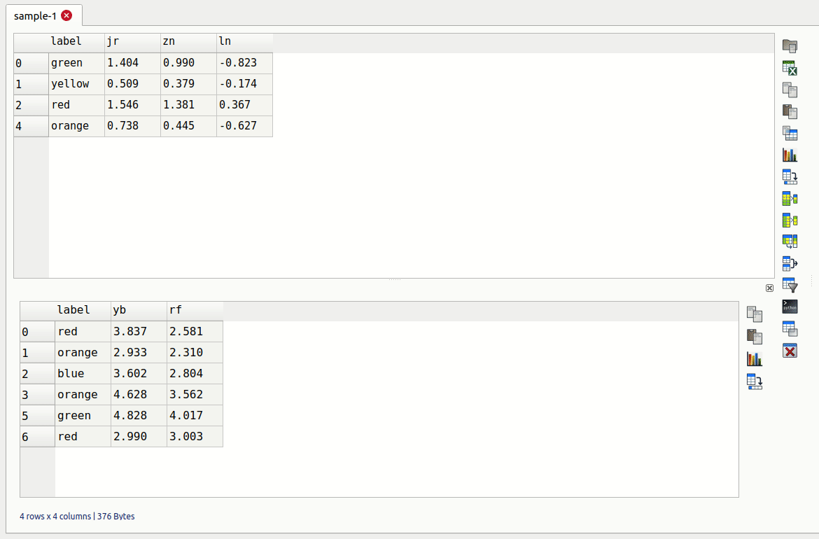
Merging two tables
Merging tables is done in tablexplore by first putting your second table in the sub-table below. You can do that by pasting it from another sheet or making an empty sub-table and importing. Once this is done you open the merge dialog in the toolbar. You select which columns in each table to merge on (at least one columns should be shared between each). The apply and the result is opened in the dialog to preview. You can copy this to a new sheet.
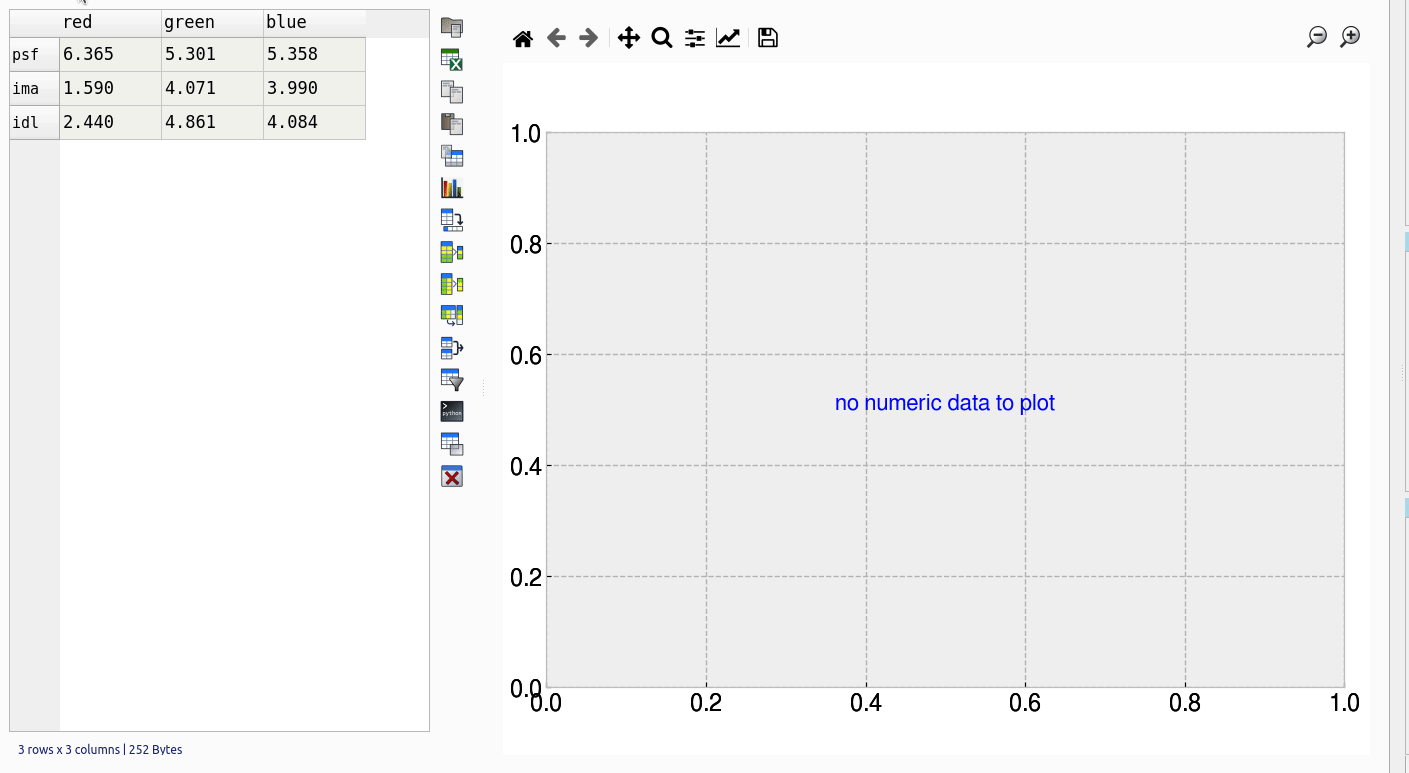
Transpose tables
A transpose is rotating the table on its axes so the rows become columns and vice versa. This can be useful for plotting purposes when you want to treat the row data as series. This is illustrated in the animation below. Your row index will become the new columns when you transpose, so you should make sure the correct index is set beforehand. If you make a mistake you can undo or transpose again to reverse. Note: transposing extremely large tables might be slow.
Filtering tables
Filtering tables is done using either a string query and/or one or more pre-defined filters defined with widgets.
Filter with widgets
Pressing the filtering button will bring up the dialog below the table. Manual predefined filters can be added by pressing the + button. These are used alone or in conjunction with the string query as shown below. The filters are joined together using the first menu item using either ‘AND’, ‘OR’ or ‘NOT’ boolean logic. When filtered results are found the found rows are highlighted. You can also limit the table to show the filtered set which can be treated as usual (i.e. plots made etc). Closing the query box restores the full table. If you want to keep the filtered table you can copy and paste in another sheet.
String filter
String based queries are made up fairly intuitive expressions in Python syntax. The one caveat is that column names cannot contain spaces to be used in an expression. It is best in these cases to convert column names (i.e. replace spaces with an underscore ‘_’). You may also use Python/pandas style expressions to perform filters, useful with string based queries.
Examples of string filters:
x>4 and y<3 #filter by values of columns x and y
x.str.contains("abc") #find only values of column x containing substring #abc
x.str.len()>3 #find only rows where length of strings in x is greater than 3
Example of usage:
Applying functions
Unlike a spreadsheet there are no cell based formulas. Rather functions are applied to columns over all rows, creating a new column. New columns can be created in several ways through computations on other columns. The column header menu provides some of these like resample/transform a column or the apply function dialog. Another more general way to add functions is to use the calculation button on the toolbar. This brings up a dialog below the table where you can type function as text expressions.
Supported functions in expressions: sin, cos, tan, arcsin, arccos, arctan, sinh, cosh, tanh, log, log10, exp
Converting column names
It may sometimes be necessary to re-format column names, for example to remove unwanted characters. If you have dozens or more columns this would be time consuming, so there is a function in tablexplore to do this in one step. Accessed from Tools->Convert column names, this dialog allows you to replace characters e.g. replace spaces with ‘_’ symbol. You can also convert cases.
Resampling columns
Resampling is a way to average data over specific windows or periods. It is a possible way to smooth out noisy data for example or get an average trend. You can resample columns from the column header menu. In the example below we create a date column and then use resampling to smooth out the data in another column using a window of 7.
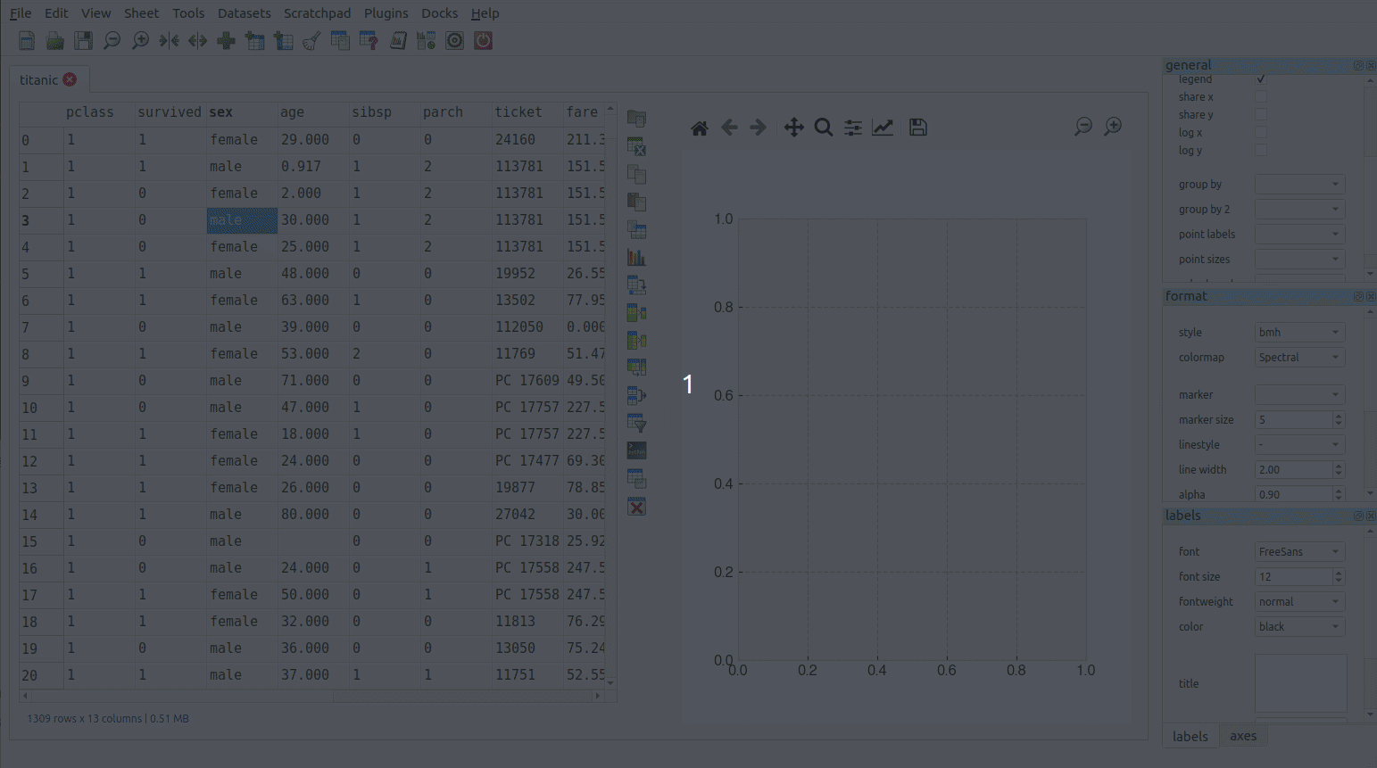
Plot options
The plot options are a series of docked widgets on the right side of the plot, grouped by functionality. The docks can be dragged to the other sides of the application window or closed. Re-opening is done from the dock menu. Most default formatting options such as the type of plot, whether to show a legend etc. are in the ‘general’ tab. If you use the program regularly you will be familiar with where things are.
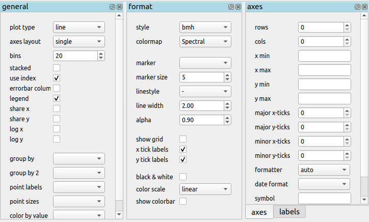
The following plot types are currently supported:
line
bar
barh
scatter
pie
histogram
box plot
dot plot
heatmap
area
hexbin
contour
scatter matrix
Plotting grouped data
Rather than grouping the table directly and then plotting, it is also possible to plot data grouped. This requires you select the appropriate columns including the one to be grouped by and select the grouping column in the ‘groupby’ menu in the plot options. Plots can be grouped by 1-2 columns at once.
Scratchpad
The scratchpad is used to store plots as you go along, that can be viewed and saved later. It’s also used for tables in text. It can be useful for resizing plots before saving for example. The plots stored here are saved with your project so can be retrieved at any time.
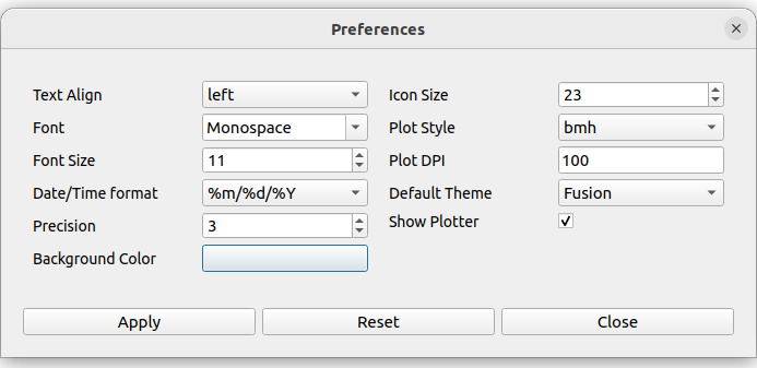
Setting preferences
Application settings are set from the Edit->Preferences menu. The image below shows the settings which are mostly self explanatory. If settings get corrupted or you want to restore defaults use the ‘reset’ button.
The terminal
For those familiar with Python and pandas a basic terminal is included, accessible from the toolbar. This will appear below the table. You can then run any Python command via the intepreter. The current table data is initially assigned to the df variable and the table can be accessed from the table variable. For example to add a column called ‘new’ you would do the following:
df['new'] = 3
table.refresh()
Any pandas operation can be performed. You need to call table.refresh() to update the table after making changes to the underlying dataframe.
Working example is shown here:
Plugins
Plugins can be added by anyone (see code examples on how to do this). Currently there are are only a few useful built-in plugins. New ones will be added below. To add a third party plugin (just a .py file), place it in the plugin folder under <home dir>/.config/tablexplore. For security, you shouldn’t just download and run any .py file without trusting it first.
Colormap tool
This allows you to add your own colormaps for plotting. The screen grab below shows you. You can generate random colors, then edit them. When done choose the type of colormap and then save. Pick a name and this is stored and added to the list of of colormaps in the plot options. You have to restart the program to see it. (Colormaps are kept under .config/tablexplore/cmaps.pkl which can be deleted if you want to clear them.)
Seaborn plugin
Seaborn is a statistical plotting package for Python. This plugin lets you use it as an alternative to the regular plotting tools. Note that you need to have installed tablexplore using pip for this to work and it is not currently part of the standalone windows application or the snap. The plugin has a set of drop down menus mostly for selecting which column in your table you want to be plotted in which dimension. These won’t all be intuitive unless you have used seaborn.
It is assumed that your data is in ‘long form’ or ‘tidy’ format.
Typical usage is shown below: